You’ve spent hours crafting the perfect design—choosing colors, refining layouts, and painstakingly selecting a font that captures your brand’s essence. But when you preview it online, the text looks blurry, or worse, fails to load entirely. Sound familiar? The culprit? Choosing the wrong font format. Understanding the difference between OTF and WOFF isn’t just technical jargon—it’s the key to ensuring your work looks flawless everywhere, from business cards to browser tabs. Let’s break down these formats so you can make confident, informed decisions.
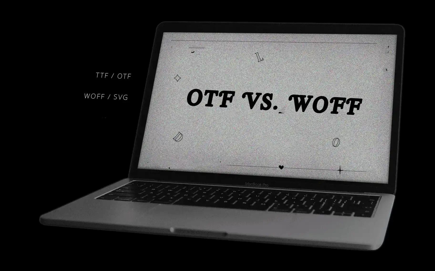
What is difference between OTF and WOFF?
OTF (OpenType Font): The Designer’s Powerhouse
Born from a collaboration between Microsoft and Adobe, OTF is a versatile format designed for both print and digital use. Think of it as the Swiss Army knife of fonts:
- Advanced features: Supports ligatures, stylistic alternates, and multilingual characters.
- High-resolution clarity: Ideal for logos, posters, or eBooks where detail matters.
- Software compatibility: Works seamlessly with Adobe Creative Suite, CorelDRAW, and desktop publishing tools.
But here’s the catch: OTF files are larger and lack built-in compression. Using them on websites can slow loading times, hurting user experience and SEO.
WOFF (Web Open Font Format): Built for Speed and Efficiency
Introduced in 2009, WOFF was created to solve a problem: making web fonts fast and reliable. It’s essentially a compressed wrapper for OTF or TrueType fonts, optimized for the web. Key perks:
- Smaller file sizes: Reduces load times by up to 40% compared to OTF.
- Universal browser support: Works flawlessly on Chrome, Firefox, Safari, and Edge.
- Metadata-friendly: Stores licensing info directly in the file.
WOFF sacrifices some advanced typographic features for speed, making it a go-to for blogs, e-commerce sites, and apps.
Difference between OTF and WOFF: A Side-by-Side Breakdown
Performance and Use Cases
| Factor | OTF | WOFF |
|---|---|---|
| Best For | Print, branding, editorial | Websites, apps, SEO |
| File Size | Larger (no compression) | Smaller (lossless compression) |
| Browser Support | Limited, inconsistent | Universal (W3C standard) |
| Advanced Features | Full support (ligatures, etc.) | Depends on original font data |
When to Choose Each Format
- Pick OTF if you’re:
- Designing for print or high-res digital displays.
- Using complex typography (e.g., swashes, multilingual glyphs).
- Prioritizing creative flexibility over load speed.
- Pick WOFF if you’re:
- Building a website or app.
- Focused on SEO (Google penalizes slow sites).
- Need fonts to load consistently across devices.
How to Convert OTF to WOFF (and Vice Versa)
Tools You Can Trust
- Font Squirrel Generator: Free, browser-based, and beginner-friendly. Upload your OTF, tweak compression settings, and download WOFF.
- Transfonter: Batch-convert fonts and subset glyphs to trim file sizes further.
- Adobe Fonts: Integrates with Creative Cloud for designers juggling print and web projects.
Pro Tips for Conversion
- Always keep a backup of your original OTF files.
- Test converted WOFF fonts on multiple browsers using tools like BrowserStack.
- Use subsetting to remove unused characters (e.g., extra languages) and reduce file size.
Frequently Asked Questions
Can I use OTF fonts on my website?
While technically possible, WOFF is the smarter choice. OTF lacks compression, slowing your site and frustrating visitors.
Does WOFF support all languages?
WOFF inherits the original font’s capabilities. If your OTF includes Cyrillic or Arabic glyphs, the WOFF version will too—but subsetting can remove them.
Which format is better for SEO?
WOFF wins. Faster load times boost Core Web Vitals scores, a critical SEO ranking factor.
Conclusion:
Your font format isn’t just a technical detail—it’s a strategic choice. Need pixel-perfect precision for a luxury brand’s brochure? OTF is your ally. Building a lightning-fast landing page? WOFF ensures your text loads instantly.
Ready to put this knowledge into practice? Audit your current projects. Are you using the right font format for the job? Share your biggest font win (or nightmare) in the comments below—let’s learn from each other!