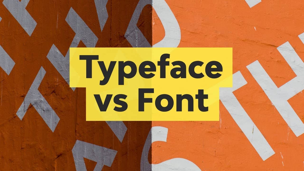
If you’ve ever wondered why designers obsess over terms like “font” and “typeface,” you’re not alone. Many people use these words interchangeably, but they’re not the same thing. Understanding the difference between a font vs typeface isn’t just semantics—it’s key to creating professional designs, branding, and even improving readability.
What is a Typeface?
A typeface is the artistic design of lettering. Imagine it as the “personality” behind the text. For instance, Times New Roman and Arial are typefaces—each has a unique style, stroke width, and mood.
Key Facts About Typefaces
- Design Consistency: All letters, numbers, and symbols in a typeface share the same visual DNA.
- Historical Roots: The term dates back to the era of metal typesetting. A classic example is Garamond, created in the 16th century.
- Categories: Typefaces fall into groups like serif (e.g., Georgia), sans-serif (e.g., Roboto), and script (e.g., Brush Script).
There are over 200,000 typefaces in existence today, but only a few dozen are widely used in design.
What is a Font?
A font is the implementation of a typeface. If a typeface is a song album, a font is a single track. For example:
- Typeface: Helvetica
- Fonts: Helvetica Light 10pt, Helvetica Bold Italic 14pt
Font Styles and Variations
| Font Attribute | Examples |
|---|---|
| Weight | Light, Regular, Bold |
| Size | 12pt, 18pt, 24pt |
| Style | Italic, Condensed, Outline |
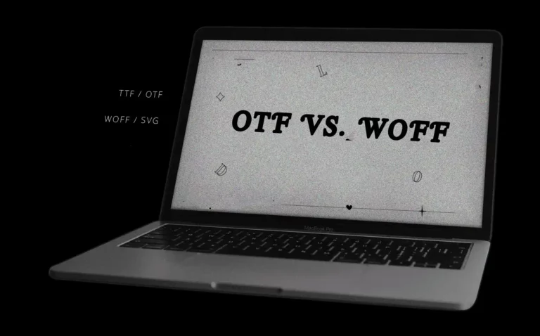
In the digital age, fonts are files (e.g., .TTF, .OTF) that tell your computer how to display text.
Font vs Typeface – What’s the Difference?
Let’s settle the font vs typeface debate once and for all:
| Typeface | Font |
|---|---|
| Design family (e.g., Roboto) | Specific style (e.g., Roboto Bold 16pt) |
| Created by typographers | Created by software engineers |
| Timeless (rarely changes) | Adaptable (infinite variations) |
Why does this matter?
- Designers choose typefaces to set a brand’s tone (e.g., playful vs professional).
- They pick fonts to create contrast (e.g., using bold for headlines and light for body text).
The History of Fonts and Typefaces
To truly grasp the font vs typeface distinction, let’s rewind to where it all began. Typography has shaped human communication for centuries, evolving from carved stone to digital pixels.
Key Milestones in Typography History
- Ancient Scripts (3000 BCE): Early writing systems like Egyptian hieroglyphs and Roman inscriptions used carved letterforms—the ancestors of modern typefaces.
- Gutenberg’s Printing Press (1440): Johannes Gutenberg revolutionized typography by inventing movable metal type. Each metal piece was a font (e.g., size/style), while the design (e.g., Blackletter) was the typeface.
- Industrial Revolution (1800s): Mechanized typesetting (e.g., Linotype machines) allowed mass production of fonts in standardized sizes.
- Digital Era (1980s): Adobe’s PostScript made scalable digital fonts (like .TTF files) possible, decoupling fonts from physical limitations.
Timeline of Typography Innovations
| Year | Innovation | Impact |
|---|---|---|
| 1440 | Movable Type | Enabled book printing |
| 1886 | Linotype Machine | Automated typesetting |
| 1957 | Helvetica Typeface | Became a design icon |
| 1984 | Adobe PostScript | Revolutionized digital fonts |
| 2010 | Google Fonts | Democratized web typography |
Case Study: The Rise of Helvetica
- Typeface: Helvetica (Latin for “Swiss”) was designed in 1957 by Max Miedinger.
- Fonts: Its clean, neutral style spawned countless font variations (e.g., Helvetica Bold, Helvetica Light).
- Legacy: Used in logos for BMW, NASA, and NYC Subway, proving how a typeface can define global brands.
Quote: “A typeface is the clothing of words. Fonts are the sizes and styles that make them fit the occasion.” – Erik Spiekermann, typographer.
Common Misconceptions About Fonts and Typefaces
Let’s bust myths that muddy the font vs typeface debate:
Myth 1: “Font and typeface mean the same thing.”
- Truth: While related, they’re distinct. A typeface is the design (e.g., Garamond); a font is its implementation (e.g., Garamond Italic 14pt).
Myth 2: “Only designers need to know the difference.”
- Truth: Writers, marketers, and even social media managers benefit. Picking the right font (e.g., bold for emphasis) affects readability and engagement.
Myth 3: “Digital tools have made typefaces obsolete.”
- Truth: Typefaces are more relevant than ever! Digital platforms rely on web fonts (e.g., Open Sans) to maintain brand consistency.
Quick Fixes for Confusion
- Ask: “Is this about the design (typeface) or the file/style (font)?”
- Example:
- ✅ “I love the Futura typeface for its geometric look.”
- ✅ “Use Futura Bold 16pt font for the headline.”
How to Choose the Right Typeface for Your Project
Selecting the perfect typeface can make or break your design. Whether you’re crafting a logo, website, or brochure, the right choice enhances your message, builds trust, and reflects your brand’s personality. Let’s break down how to choose wisely.
Factors to Consider
- Purpose of the Project
- Branding: Use bold, unique typefaces (e.g., Futura for tech brands).
- Readability: Prioritize clean, simple designs (e.g., Open Sans) for body text.
- Emotion: Script typefaces (e.g., Lobster) evoke creativity, while serifs (e.g., Merriweather) feel traditional.
- Target Audience
- Formal Audiences: Stick to classic serifs like Times New Roman or Georgia.
- Young Audiences: Playful sans-serifs like Comic Sans (use sparingly!) or rounded fonts like Nunito.
- Medium
- Print: Serifs (e.g., Garamond) work well for books.
- Digital: Sans-serifs (e.g., Roboto) are easier to read on screens.
Typeface Categories and Their Best Uses
| Category | Example Typefaces | Best For |
|---|---|---|
| Serif | Georgia, Times New Roman | Print media, luxury branding |
| Sans-Serif | Helvetica, Arial | Websites, modern logos |
| Script | Brush Script, Pacifico | Invitations, creative projects |
| Monospace | Courier New, Roboto Mono | Coding, tech-related content |
Case Study: Airbnb’s Typeface Shift
In 2014, Airbnb redesigned its branding and adopted Circular, a custom sans-serif typeface. Why?
- Clarity: Circular’s geometric shapes improved readability across apps and websites.
- Versatility: It worked seamlessly in 14 languages, supporting Airbnb’s global audience.
- Brand Identity: The rounded edges conveyed warmth and approachability.
Result: A 30% increase in user engagement post-rebrand.
Designer Tip: “Pair a decorative typeface with a neutral one. For example, use Playfair Display (serif) for headlines and Lato (sans-serif) for body text.” – Jessica Hische, lettering artist.
5 Common Mistakes to Avoid
- Using Too Many Typefaces: Stick to 2-3 per project.
- Ignoring Hierarchy: Use bold fonts for headlines and lighter ones for subtext.
- Overlooking Licenses: Ensure commercial licenses for branded projects.
- Forgetting Responsiveness: Test how typefaces scale on mobile devices.
- Mismatching Tone: A law firm’s website shouldn’t use Comic Sans.
Quick Checklist for Choosing a Typeface
✅ Does it align with my brand’s personality?
✅ Is it readable at all sizes?
✅ Does it support the languages I need?
✅ Have I checked licensing restrictions?
How to Use Fonts Effectively in Design
Choosing the right fonts is only half the battle—using them effectively is what separates good design from great design. Let’s explore strategies to maximize impact while avoiding common pitfalls.
1. Establish Visual Hierarchy
Fonts help guide the reader’s eye. Use contrast in size, weight, and style to create order:
- Headlines: Bold, large fonts (e.g., Montserrat Bold 32pt).
- Subheadings: Medium weight, slightly smaller (e.g., Montserrat Semi Bold 24pt).
- Body Text: Light or regular weight for readability (e.g., Montserrat Regular 16pt).
Example:
“Hierarchy isn’t just about size—it’s about guiding the viewer through your content like a roadmap.” – Ellen Lupton, design educator.
2. Leverage Contrast and Consistency
- Contrast: Pair fonts with opposing traits (e.g., a serif headline with a sans-serif body).
- Consistency: Use the same font styles for similar elements (e.g., all buttons in Roboto Medium).
| Do | Don’t |
|---|---|
| Combine Roboto Bold (headline) with Roboto Light (body) | Use Comic Sans for a legal document |
| Limit to 2-3 fonts per project | Mix 5+ fonts and confuse the reader |
3. Combine Fonts Within a Typeface Family
Most typefaces (like Inter or Lato) include multiple fonts. Stick to one family for harmony:
- Bold Italic for callouts.
- Light for captions.
- Regular for paragraphs.
Case Study: Medium’s Typography Overhaul
In 2020, Medium redesigned its reading experience with Charter (serif) for articles and Inter (sans-serif) for UI. Results:
- 15% increase in average reading time.
- Users reported a “calmer, more focused” experience.
4. Optimize for Readability
- Line Spacing: 1.5x the font size (e.g., 16pt font → 24pt line height).
- Line Length: 50-75 characters per line for comfortable reading.
- Color Contrast: Use tools like WebAIM to ensure text stands out against backgrounds.
5 Font Best Practices
- Test on Multiple Devices: Ensure fonts render well on mobile, tablets, and desktops.
- Use Web-Safe Fonts: Default to system fonts (e.g., Arial, Georgia) for faster load times.
- Avoid All Caps: Reserve uppercase for short headlines or logos.
- Prioritize Accessibility: Use larger fonts (16pt+) for body text.
- Less is More: Simplify choices to avoid overwhelming the audience.
Font vs Typeface in the Digital Age
The rise of digital design tools has blurred the lines between fonts and typefaces for casual users—but the distinction remains critical for professionals. Let’s explore how technology has reshaped typography and why understanding font vs typeface still matters.
How Digital Tools Handle Fonts and Typefaces
Modern software like Adobe Photoshop, Figma, and Canva often use the term “font” colloquially, but here’s what’s happening under the hood:
- Typefaces Are Now Digital Families
- A typeface (e.g., Roboto) is downloaded as a collection of font files (e.g., Roboto-Regular.ttf, Roboto-Bold.ttf).
- Designers access these files through tools like Adobe Fonts or Google Fonts.
- Fonts Are Dynamic and Scalable
- Unlike metal typesetting, digital fonts aren’t confined to fixed sizes. A single .TTF file can scale to any size without losing quality.
- Variable Fonts: The Game-Changer
- Variable fonts (e.g., Inter Variable) let you adjust weight, width, and slant within one file.
- Example: A slider in Figma can morph Inter from Light to Black without switching fonts.
Traditional vs. Digital Typography
| Aspect | Traditional | Digital |
|---|---|---|
| Typeface Creation | Hand-drawn, carved in metal | Designed in software (e.g., Glyphs, FontLab) |
| Font Delivery | Physical metal blocks | Files (TTF, OTF, WOFF) |
| Customization | Limited to pre-made sizes/styles | Infinite adjustments (size, weight, kerning) |
| Cost | Expensive (per font/style) | Often free or subscription-based |
Case Study: The New York Times’ Digital Font Shift
In 2020, The New York Times switched to a custom typeface called NYT Cheltenham for its digital platform. Why?
- Font Optimization: The new web fonts reduced load times by 30%.
- Consistency: The typeface maintained its print-era elegance while adapting to screens.
- Brand Identity: Custom glyphs (like the iconic “T”) reinforced recognition across devices.
Result: A 12% increase in mobile readership and improved accessibility.
Quote: “Digital tools haven’t erased the font vs typeface debate—they’ve made it more nuanced. A typeface is the soul; fonts are its digital body.” – Nadine Chahine, type designer.
Top 5 Digital Typography Trends
- Variable Fonts (e.g., Work Sans Variable)
- Save bandwidth by replacing multiple font files with one.
- AI-Generated Typefaces
- Tools like Fontjoy use machine learning to suggest font pairings.
- Web Font Dominance
- Over 50% of websites use Google Fonts (e.g., Open Sans, Roboto).
- Emoji as Typography
- Platforms like Slack use custom emoji fonts to enhance communication.
- Dark Mode Optimization
- Designers tweak font weights for better readability in dark themes.
Why the Font vs Typeface Distinction Still Matters
Even in the digital age, mixing up these terms can lead to:
- Design Errors: Using the wrong font weight for a brand’s guidelines.
- Communication Gaps: Misunderstandings between designers and developers.
- Inconsistent Branding: A logo’s typeface might render poorly if the correct fonts aren’t embedded.
Pro Tip: When handing off designs to developers, specify:
- The typeface (e.g., “Use the IBM Plex Sans typeface”).
- The exact font (e.g., “Apply IBM Plex Sans Bold 24px for headings”).
FAQs
Let’s tackle the most common questions people ask about fonts and typefaces
Is Arial a font or a typeface?
Arial is a typeface. Its variations (e.g., Arial Bold, Arial Narrow 12pt) are fonts.
Example:TypefaceFont ExamplesArialArial Regular 11pt, Arial Bold Italic 14pt.
Can a typeface have multiple fonts?
Absolutely! Most typefaces include dozens of fonts. For example:
Helvetica Typeface: Helvetica Light
Helvetica Bold
Helvetica Condensed
Helvetica Rounded
Why do designers care about the difference?
Consistency: Using the right fonts ensures brand materials (logos, websites) look unified.
Functionality: Bold fonts grab attention; light fonts improve readability.
Professionalism: Knowing the terms avoids miscommunication in teams.
Are ‘font’ and ‘typography’ the same thing?
Typography: The art of arranging text (includes fonts, spacing, alignment).
Font: A single style/size within a typeface.
Typeface: The design family (e.g., Times New Roman).
How many fonts are in a typeface?
Basic Typefaces: 4-6 fonts (e.g., Regular, Bold, Italic, Bold Italic).
Extended Families: 20+ fonts (e.g., Inter includes Thin, ExtraLight, Light, Regular, Medium, SemiBold, Bold, and more).
Can I create my own typeface?
Yes! Tools like Glyphs, FontLab, and Birdfont let you design custom typefaces.
What’s the most common font mistake?
Bad: A poster with 5 different typefaces (looks chaotic).
Good: A poster with 1 typeface (e.g., Futura) and 3 fonts (Bold, Regular, Light).
Do I need a license to use fonts?
Free Fonts: Check licenses (e.g., Google Fonts are free for commercial use).
Premium Fonts: Sites like MyFonts or Adobe Fonts require purchasing licenses.
Conclusion
The font vs typeface debate isn’t just about semantics—it’s about clarity, professionalism, and creating impactful designs. Whether you’re building a brand, designing a website, or crafting a resume, understanding these terms ensures your work stands out for the right reasons.
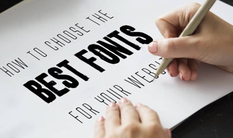
Ready to level up your typography skills? Check out our guide to Choosing the Best Fonts for Your Website or explore Google Fonts to experiment with typefaces.